
Showing posts with label Cinematic Spaces. Show all posts
Showing posts with label Cinematic Spaces. Show all posts
Thursday, 24 October 2013
Wednesday, 23 October 2013
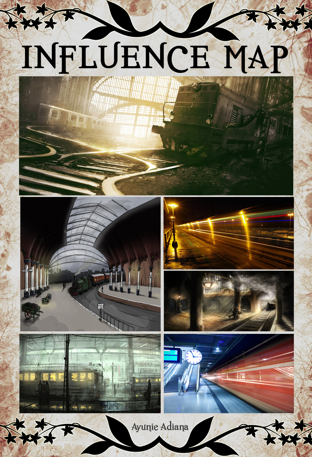
Cinematic Spaces: Final Concept Painting (Scene 3)
Here's my third final concept paintings from my book excerpt - Metropole by Ferenc Karinthy.
 |
| Concept 3-- Distorted City |
Cinematic Spaces: Final Concept Paintings (Scene 1 and 2)
Here's two of my final concept paintings from my book excerpt - Metropole by Ferenc Karinthy.
 |
| Concept 1: Train Station |
 |
| Concept 2: Church |
Tuesday, 22 October 2013
Cinematic Spaces : Metropole CD Artwork
For this project, I have decided to use some of my previous thumbnails to create the CD Artwork.


Sunday, 20 October 2013
Cinematic Spaces: Metropole Church Scene - Different Design, Coloured
Before I go on to adding details to the scene, I went to read my excerpt again to see how it was described. My first design does not really fulfill the description and hence, I am came up with this new design. I am liking it as there are arches and pointed towers. The difference between the first and second row of thumbnail is the colour of the window the cross is on. I like 103, 105 and 107.
 |
| Previous Thumbnail |

Cinematic Spaces: Metropole Train Station Scene - Further Development
After OGR, I have decided to change one of my scenes from a cemetery scene to the train station scene. Though it was only small part of the excerpt and was not described in detail, I saw a potential to develop this scene. I had a little bit more room to be imaginative.

 |
| Thumbnail 100 |
As I am trying to achieve a busy place, the use of these brush strokes have effectively allowed me to achieve a constant motion. However, I think this can be further developed into something more interesting with use of a compound colour which I have decided to use in this scene.
Saturday, 19 October 2013
Cinematic Spaces: Metropole Train Station Scene- Depth
In this scene, I did not have a problem with my perspective but I did, however, had problem dividing my scene to create the necessary depth as can be seen in Figure 1. After placing and adding the elements I want in this scene(Thumnail 94), I went ahead blocking out different shades of grey to create the needed depth as seen in thumbnail 95.
 |
| Figure 1: Coloured thumbnail before additional editing |

Once I created the depth, I tried using different shades of blue. I am liking 98. After doing the coloured thumnbnails, it made me doubt my initial certainty of using either monochromatic and analogue colours to create this scene. Looking at my other two scenes, I need to find a common ground visually so I have decided to go with compound colours instead.
Friday, 18 October 2013
Cinematic Spaces: Metropole Church Scene- Coloured Thumbnails
After getting feedback from Jordan in regards to this scene of mine, I tried different colours to the scene and changing the horizontal line to be less diagonal. I am liking thumbnails 88 and 92 as the colour contrast is interesting which I can see potential for further development to be more polished.

Cinematic Spaces: Metropole - City Scene (Further Development)
This is my city scene. After further development, I added more buildings and structures to the scene and I feel that I am achieving the cramped environment I am looking for.
 |
| Before Development |
 |
| After development |
Tuesday, 15 October 2013
Cinematic Spaces: Metropole - Church Scene
For my church scene, I have decided to try out with a 3 point perspective which I feel is still not quite there yet along with a diagonal horizon line. I surprised myself with the vibrant compound colours that this painting turned out to have. I am still considering if I should stick to it or making it darker because this book I have is all about dark emotions.

Monday, 14 October 2013
Cinematic Spaces: Metropole - City Scene
From thumbnail 64, I went to further develop my scene by trying out complementary colours to make up the scene. I am going for abstract busy cramped city and I feel that I am getting there.
 |
| Thumbnail 64 |
 |
| City Scene |
Sunday, 13 October 2013
Cinematic Spaces: Metropole - Train Station Scene
So this is my first attempt in exploring complementary colours for one of my scenes. The difference between these two images are very subtle. The light coming through from the end of the tunnel and the windscreen are the only differences. I am still looking for ideas on how to make this scene more visually captivating because it seems very dull.
 |
| Version 1 |
 |
| Version 2 |
Cinematic Spaces: Metropole Thumbnails (70 - 85)
These thumbnails are from my previous ones. I added colours to see the kind of style I wanted.
.jpg)
Looking into concept art from Disney's animated films such as Pocahontas and Princess and the Frog, I have decided to narrow my choice of colours to complementary and monochromatic ones as I think it will be most effective in the dark and distorted environment my book was set in. I will focus on these types of colours in my next set of thumbnails.
 |
| Figure1: Pocahontas Concept Art |
 |
| Figure1: Princess and the Frog Concept Art |
List of Illustrations:
Figure 1 Pocahontas (1995) [Concept Art] at
http://www.animatedviews.com/wp-content/uploads/archives/poca4.jpg
Figure 2 Princess and the Frog (2008) [Concept Art] at thttp://www.firstshowing.net/img/PrincessandtheFrog-concept-04.jpg accessed on 13 October 2013
Wednesday, 9 October 2013
Sunday, 6 October 2013
Cinematic Spaces: Metropole Thumbnails (54 - 69)
Here's my last set of black and white thumbnails before I go on to adding colours to it. I am liking 54, 65 and 67. The common thing between these three thumbnails is the perspective which I particularly favour.
.jpg)
Saturday, 5 October 2013
Cinematic Spaces: Metropole Thumbnails (29 - 53)
Here's my third set of thumbnails. I went to read the book excerpt again and to see if I have missed out on any interesting visual scene that potentially could lead to my key thumbnails. My thumbnails from 29- 32 are abstract ones where I try to combine all the elements of the story on to an image. I like #32 as it reflects when my main character was experiencing and he's tearing because he was lost in this unknown city. The other thumbnail that I see potential in is #50 where the interior of the church is heavily decorated with paintings and statues.
.jpg)
Sunday, 29 September 2013
Cinematic Spaces: Metropole Thumbnails (17-28)
I see improvement after comparing this set of sketches to my first one. I am getting comfortable using different brushes and changing their properties as I work on it. I've also used different perspectives in my sketches. I see myself progressing which is definitely great and I hope by completing all the thumbnails needed for this project, I'll be more confident and comfortable in doing thumbnail sketches for future projects.

Cinematic Spaces: Metropole Thumbnails (1-16)
Here's my first 16 sketches for my book Metropole. Some of the thumbnails are repetitive because I my thoughts of the same scene were different so I decided to pen it down. As can be seen from my sketches, my perspective are all similar which I have to try to experiment with other angles to make my sketches more interesting. Aside from that, I am still trying to get the hang of the different tones.
.jpg)
Subscribe to:
Posts (Atom)