Showing posts with label Environment. Show all posts

Friday, 27 May 2016

New Designers: Environment Adjustments

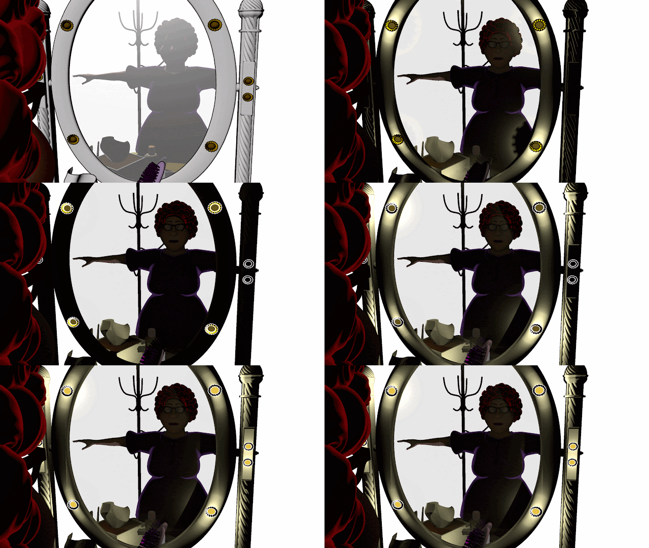
As suggested, I have made the environment softer, less harsh and made sure it is not overexposed. Below are stills of the experimentation to the exposures.
Initial Environment
Adjusted ambient occlusion for the environment and assigned a different one to the windows and sign

Further Adjustments

Final Result

It is slightly darker than these uploaded ones.

Tuesday, 9 February 2016

Major Project: Scene 1 (Poses)

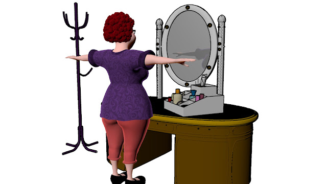
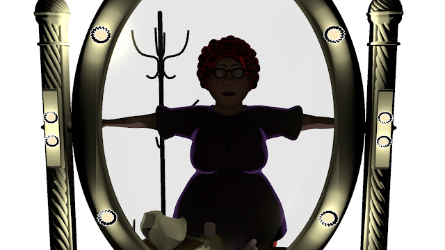
From the animation I previously did, I came to realisation what I was doing wrong. I was trying to animate frame by frame which I have made it difficult for myself. So, to help out with my animation, I have set my character to key poses (5 poses for different hats) and eventually she'd be happy with the final hat.

As of now, the character is mostly straight on but I will make have turn at angle slightly to be able to show her exaggerated actions further.


Major Project: Scene 1 (Test Animation)

I was not able to playblast this scene as it the reflection will not show on the mirrors. I did a render to help me visualise it in motion and gives me a better understanding of what I really want to achieve for this scene.

Having said that, I will now exaggerate her postures and facial expressions to push what can be achieved.

Monday, 8 February 2016

Major Project: Environment Model

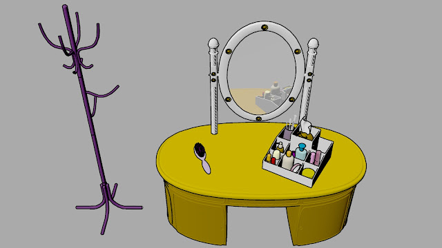
Here are environment of two of the 20 scenes for my animation modelled. In terms of textures, I will just use base colours.

Render Still
Rendered Still

Thursday, 4 February 2016

Major Project: Scene 1(Lighting and Camera Placement)

Since my character is all done, I will be moving into previz. However, I needed to make a decision of whether or not to have outlines to my environment. I basically want to have simple colours for my environment because I want my character to be the star of each scene. I've tested a base colour texture for my things with outlines (to have drawing kind of effect). It looks good as still images but not as what I've imagined it to be in an animation.
Set Textured
Set with Outlines
I've also tested where I should place my camera and did some lighting tests.

Test Shot of Camera Placement
Lighting Tests
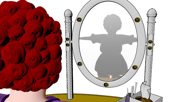
Having done that, I prefer to have the camera be her, looking at the mirror and seeing her own reflection. Lighting still needs to be sorted but I will be working on a previz for this scene first.
Mirror Shot

Monday, 5 January 2015

Sunday, 4 January 2015

Part B (Character) - Achievement Page

This is my progress page to track the records of the player and I have done colour comps for it.
Colour Comp 01
Colour Comp 02
Colour Comp 03
Colour Comp 04
Colour Comp 05
Colour Comp 06
Colour Comp 07
I think colour comp 01 will fit nicely with my whole concept because the colours are eye popping and child friendly too.

Friday, 2 January 2015

Part B (Character) - Start Page

This is the start page of my game and I did several colour comps to see which start page fits with my overall look for the game. I think colour comp 02 and colour comp 06 fits the overall look as it seems to be more child friendly.

Colour Comp 01
Colour Comp 02
Colour Comp 03
Colour Comp 04
Colour Comp 05
Colour Comp 06
Colour Comp 07

Thursday, 1 January 2015

Part B (Character) - Final Game Play

To understand how my characters, environment and bringing my idea of the game to live, I have created the game itself. This is a level from the game. 

Like all educational games, there are level of difficulty and this is the easy level. I am quite pleased as how the game turns out to be as it is what I had in mind.

Monday, 29 December 2014

Part B (Character) - Game Title Design Development

I went to further develop my game's title and I've come up with these. 

Design 04

Design 05

I am going for Design 05 as my choice of logo for the game.

Part B (Character) - What's the game?

I have decided to name my game 'Math Odyssey'. Here are few designs of the logo.


Design 01

Design 02
For the following design, I have incorporated the silhouettes of my characters to be part of the letters.
Design 03

Sunday, 28 December 2014

Part B (Character) - Game Interface Colour Comps

For the colour comps, I've tried using monochromatic colours as seen in comp 01, 02 and 03.
Colour Comp 01
Colour Comp 02
Colour Comp 03
However, I am not entirely sure if it is working so I went back and used tried colours and here are the results.

Colour Comp 04
Colour Comp 05
Colour Comp 06
I like how there is some sort of calmness present in the colours in comp 04. However, I also like the striking colour present in comp 5 because it pops out and eye catching. Will continue to further develop on the colours.

Part B (Character) - Game Interface Background Development

As I am struggling with the colours for the interface, I did a colour a couple of colour comps but the whole interface still does not seem right because of the background.

Colour Comp 01
Colour Comp 02
So I went back and did a one point perspective background again and this is the result.


I am satisfied as how it turns out because this is what I am trying to achieve. I will work on the colours further now.

Friday, 26 December 2014

@Alan @Justin Part B (Character) - Game Interface Further Development

For my background, I am trying to achieve a deeper depth to the whole composition. 

In my first development, I added a table and a crane. However, I found out that to achieve a deeper depth, I shouldn't have the table facing the front but into the space instead.

Development 01
Hence, in my second development, I try to add elements with one point perspective in mind. I feel that it is working better now however, I am disliking the colours. It still seems quite dark.

Development 02
I tried following the colour wheel so that my colours compliment each other. 


Alan & Justin, what do you suggest I do because I do not want my colours of the environment to overpower my characters.