Saturday, 28 December 2013

Secret Lair: Clockwork Priestess Character Model

During this break, I have decided to bring my drawing of my character from the last project, alive. I sculpted the body in ZBrush as I found it easy to use the Zspheres to help create the whole structure of the body. As for the head, I used the base shape of a head I sculpted from my previous project and sculpted it to achieve as close as possible to my drawing. I think that the nose will need further refinement and eyebrow needs to be added to the facial features of my character.
Character Sketch

Full Shot of Character

Frontal Shot
Took quite some time to do the braids for my character but by just plugging in the lambert shader to texture the hair, the details were lost. I would want to experiment with the textures by either painting it in ZBrush to give it some highlights or create a hair system from the polygons that are used to make up the braid.
Left View

Right View
 I created the base shape of the boots in Maya and brought it into Zbrush to sculpt the desired shape.
Close Up of Boots
For the textures, I just used lamberts for now to see how it looks like but will paint the textures in Zbrush. 

Now, I am working on how to make the clothes for my character. So far, I've been enjoying myself while creating this character as I've sculpted it based on my imagination. 

Wednesday, 11 December 2013

@Alan Secret Lair: Clockwork Priestess Lair Final Render Problem

This is my final rendered scene but I am having difficulty with the glow. I've checked all my settings and it is the same as the ones in the tutorials. As I have candle lamps around my lair, I would need it to  emit light and glow. After rendering the whole scene, my glow doesn't appear. It only appears when I select a region of it to render. What could possibly be the problem though?

Final Render
Region Render

Secret Lair: Clockwork Priestess Lair Further Development

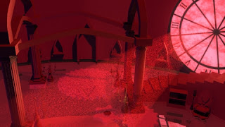
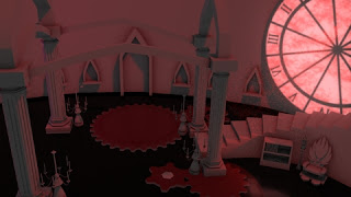
Initially, after my render as seen in Figure 1, I thought I was done. But since I had more time, I went back in to tweak the lightings as seen in Figure 2. It is not my final image yet as I am still trying to push the lighting by adding rim lights to the pillars near the clock and a speck of highlights to the other column.


Figure 1

Figure 2

Secret Lair: Clockwork Priestess Digital Set Pipeline

Mise-en-scène Film Programme: Only God Forgives (2013)

Figure 1: Movie Poster [Still Image]
Only God Forgives (2013) is a French – Danish co production, written and directed by Nicholas Winding Refn. It is a film that revolves around an American man, Julian, who owns a Muay Thai Club as a cover to his ultimate business trade; drugs. The story begins with his older brother, Billy, who brutally rapes and murders an underage prostitute. This triggered an investigation by Bangkok’s cop, Chang, who was also known as the Angel of Vengeance. He roams around the city with a samurai strapped to him, and carried out what seems to him as acts of justice, in his attempt to cleanse the city from perverts and criminals, in general. 
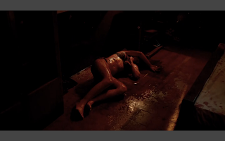
Figure 2: Dead Woman covered in Blood [Still Image]
An example of this would be in the opening scene where a dead female body covered in blood, lying on the floor of a dodgy hotel room as seen in Figure 2. As Lambie states in his review, “Drenched in blood, shadow and gaudy light, it’s a nightmarish film that refuses to play nicely from the opening scene to the last.” (Lambie, 2013)
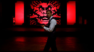
Figure 3: Julian's Fight Scene [Still Image]
The uses of the colours in this film were mostly primary colours, Red was evident in most scenes, and the darkness present throughout the film, projects some sort of suffocation that Julian feels. As Lambie points out “The use of intense colour and shadow gives the movie an oppressive, claustrophobic atmosphere” (Lambie, 2013)
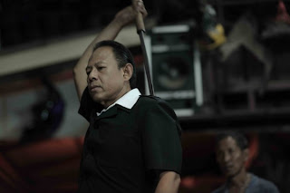
Figure 4: Chang Drawing His Samurai [Still Image]
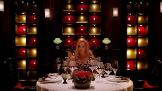
Figure 5: Crystal In The Restaurant [Still Image]
The camera are placed either at strategic angles or front on to create a balance shot. An example of a strategic angle would be when the camera is placed at a low angle, showing Chang’s emotionless expression as he draws a samurai from his back. An emotion that can be concluded from this would be superiority. The balanced shots, which, can be seen in the entire film, are similar to those in Kubrik’s film. The fronts on angles are as effective as those camera angles that have been strategically placed, as it was able to capture the emotions of a scene accurately. Woodward emphasized this point when he states “Whether gliding ominously down long, lavishly decorated corridors or fixed between doorframes looking into perfectly symmetrical rooms, DoP Larry Smith’s voyeuristic lens gives the film a hypnotic, haunted feel.” (Woodward, 2013)

In addition to the captivating, intense visuals, the sound played an important role as the film has very few dialogues. An example would be when the man that was hired by Julian’s mother, Crystal, to kill Chang was caught, he begged for mercy but it was muted and we could only see his pain and fear before Chang eventually sliced his body off, killing him instantly. In this scene, the sound was not audible and what can be interpreted from this is that no one will hear your cries and provide you any mercy for the crime you’ve committed and that you are alone to face the consequences. Bradshaw summarises the effective use of sound in the film when he states “Refn's movie is entirely gripping, put together with lethal, formal brilliance, with bizarre setpieces of sentimentality and nauseous black comedy. It has its own miasma of anxiety and evil, taking place in a universe of fear, a place of deep-sea unreality in which you need to breathe through special gills – and through which the action swims at about 90% of normal speed through to its chilling conclusion.” (Bradshaw, 2013)

Mottram concludes this movie accurately when he states, It looks and sounds magnificent, perfectly conjuring the feel of backstreet Bangkok.” (Mottram, 2013)

List of Illustrations: 

Figure 1 Only God Forgives (2013) [Poster] at http://www.impawards.com/2013/posters/only_god_forgives_ver7_xlg.jpg (Accessed on 11 December 2013)

Figure 2 Dead Woman Covered In Blood (2013) [Still Image] at http://cinema.theiapolis.com/movie-2TWY/only-god-forgives/news/only-god-forgives-1001929.html (Accessed on 11 December 2013)

Figure 3 Julian’s Fight Scene (2013) [Still Image] at http://bbdigitalproductions.com/wp-content/uploads/2013/07/ogre700.jpg (Accessed on 11 December 2013)

Figure 4 Chang Drawing His Samurai  (2013) [Still Image] at http://www.bleedingcool.com/wp-content/uploads/2013/03/only-god-forgives-vithaya-pansringarm-600x400.jpg (Accessed on11 December 2013)

Figure 5 Crystal In The Restaurant (2013) [Still Image] at http://media-1.melty.fr/media_aggregate-1455442-stream/only-god-forgives-trois-extraits-violents.jpg (Accessed on 11 December 2013)


List of Bibliography:

Bradshaw, Peter
2013
Only God Forgives Review
http://www.theguardian.com/film/2013/aug/01/only-god-forgives-review 
(Accessed on 11 December 2013)

Lambie , Ryan
2013
Only God Forgives Review
http://www.denofgeek.com/movies/only-god-forgives/26599/only-god-forgives-review 
(Accessed on 11 December 2013)

Mottram , James
2013
Only God Forgives Review
http://www.totalfilm.com/reviews/cinema/only-god-forgives
 (Accessed on 11 December 2013)

Woodward , Adam
2013
Only God Forgives Review
http://www.littlewhitelies.co.uk/theatrical-reviews/only-god-forgives-24418
(Accessed on 11 December 2013)

Saturday, 7 December 2013

Mise-en-scène Film Programme: Suspiria (1977)

Figure 1: Movie Poster [Still Image]
Suspiria(1977) is an Italian movie directed by Darioi Argento. It is considered to be one of his finest work. The film was on an American ballet student, Suzy, who got herself a place in one of the prestigious dance academy in Frieberg, Germany. The stormy weather and the brutal murder of a fellow student by an unseen attacker with demonic hands was what greeted her upon her arrival in the country. There were a few unusual events and other gruesome deaths that occurred, implying that there was something evil and bad lurking within the core of the school compound. Determined to reveal this mystery, Suzy followed the clues that she had gathered from her very first encounter with the student who ran away from the hostel on that stormy night and the one that her friend, Sara, found out about. This prestigious school was indeed, ran by a coven of witches.

Right from the start of the film, there was a tinge of red and as the story builds up and the tension grows, red filled the scenes. There was also use of yellow and blue of the sets that expresses different meaning to the story. As Gonzalez points out in his review “The film's visual palette is suggestive of a hierarchical journey through the Academy. Hallways are bathed in reds, yellows, and blues, and, in effect, different rooms in the school begin to take on a meaning all their own.”(Gonzalez, 2001). An example of the use of extreme colours can be seen in Figure 2.

Figure 2: Suzy In The Hallway {Still Image]
In addition to the colours used for this film, the vision Argento had and the skills Luciano Tovoli, the cinematographer possessed, produced camerawork and visual elements that left the audience in awe. In a book entitled Dario Argento, James Gracey emphasized this point when he said “Often cutting from extreme close-ups to wide-angle shots and point-of-view shots, the viewer is immersed in a kind of visual delirium, constantly on edge.” (Gracey, 2010:18) The edits in this film disorients the viewer as it makes daily objects and situations become potential moments of terror. This was achieved through the use of unexpected changes in character’s point of view as well as jump cuts from extrreme close up to wide shots. This can be seen in the scene where Suzy and Sara tread water in the eerie swimming pool as it was shot from the above. 

Figure 3: Suzy and Sara Treading In The Pool [Still Image]

Figure 4: Close up shot of Suzy and Sara [Still Image]
The soundtrack played an important role as much as the visual components did. The distinctive sound effects like whispers, high pitch screams and whines leaves the audience in a paranoiac mood. In her review, Linda Schulte-Sasse summarises the use of the sound accurately when she states "Sound is in perfect synch with visuals, but renders unstable the boundary between conventional, non-diegetic "mood" music and diegetic sound within the film proper, as we are haunted by sounds "from nowhere"that resemble, for example, Helene Marcos' inimitable snoring. Moreover, the power of the soundtrack makes silent passages in the film all the more tense, all the more silent. (Schulte-Sasse, 2002)

In conlusion, Suspiria is a great example of film that falls under the horror category. The two main elements of a great film, the visuals and the sound matched perfectly throughout the entire film, leaving the audience amazed. Gracey was right when he said “The intrusive soundtrack and inimitable imagery, bathed in livid reds and blues, is truly spellbinding and relentless and unlike anything before or since. Another masterpiece from Argento and one of horror cinema’s greatest works.” (Gracey, 2010 : 67)

List of Illustrations:

Figure 1 Suspiria (1977) [Poster] at http://www.filmosphere.com/wp-content/uploads/2013/06/Suspiria-affiche.jpg (Accessed on 6 December 2013)

Figure 2 Suzy In The Hallway (1977) [Still Image] at http://img.photobucket.com/albums/v692/brettc1971/suspiria7_zpsd1d326a3.jpg (Accessed on 6 December 2013)

Figure 3 Suzy and Sara Treading In The Pool (1977) [Still Image] at https://blogger.googleusercontent.com/img/b/R29vZ2xl/AVvXsEiqoIoq_Z46Ojf3VHUzB6dQIAbbYK-3NxPzjUKj5zKF5wlAgjPwX4TbwfdWekh0VNQBstY5VlnZUQdNaPcU-8RHA0OjLtamE3u_mQtkkksl2Q7NNHetLCGLah8243x3k586anCWC4B3Duo/s1600/argento_suspiria.jpeg (Accessed on 6 December 2013)

Figure 4 Close Up Shot of Suzy and Sara (1977) [Still Image] at http://i191.photobucket.com/albums/z43/sevenarts/cinema/suspiria3.jpg (Accessed on 6 December 2013)

List of Bibliography:

Gonzalez, Ed
2001
Suspiria 
http://www.slantmagazine.com/film/review/suspiria
(Accessed on 6 December 2013)

Gracey, James
2010
Dario Argento
Harpenden
Kamera Books

Schulte-Sasse , Linda
2002
Dario Argento's Suspiria (1977)
http://www.kinoeye.org/02/11/schultesasse11.php
(Accessed on 6 December 2013)


Thursday, 5 December 2013

Secret Lair: Clockwork Priestess Lair's Development

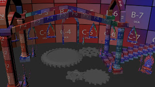
Here are my developments to my lair. Once I got the lighting set up, I added textures to the scene. From 14 to 15, after I got all the lights in, including the wall lamps, I added the Hebrew engravements to the wall and the gears with the chains below the glass surface of my ground. In 16, I added the drapes and added texture and lighting to it so that it matches my Final Concept.

14.
15.
16.
Next up, adding textures to the remaining props in the scene.

Wednesday, 4 December 2013

Secret Lair: Clockwork Priestess Lair's Lighting Test Development

I continued with my lighting test for my scene. 9 and 10 was a little purplish and the light ray was not working well so I made adjustments by plugging in the ambient occlusion as suggested. My scene turned out to be better so I continued adding candle lights around the lair as seen in 11 -13. Colours in this images are a little washed out and it doesn"t look like my rendered image.

9.
10.
11.
12.
13.

Is there a way I should have done to save the image in Maya so that it doesn't washes out when I upload it to blogger?

Tuesday, 3 December 2013

Secret Lair: Clockwork Priestess Lair's Lighting Test

Before putting in the textures, I have decided to do some light tests for the scene. For number 1 - 3, I played with the intensity of the lights to see how it affects the overall scene. For 4 and 5, I have added an ambient light and played with the colours. In 4, I just had an orange ambient light but in 5, I added a ramp to the colour as I am aiming for a gradual gradient of purple to red lights which is not much of a success.

2
4
5. 
For 6 - 8, I have plugged in the ambient occlusion node to the materials and it made the whole scene looked washed out.
6.
7.
8.

I am not sure at which stage I should be rendering the images. Is it before or after I plug in the ambient occlusion note?

Saturday, 30 November 2013

Secret Lair: Clockwork Priestess' Character Biography

Production Designer Profile

Mise-en-scène Film Programme: The Shining (1980)

Figure 1: Movie Poster [Still Image]
The Shining (1980) is a psychological horror themed movie directed by Stanley Kubrik. It was a movie based on a novel written by Stephen King of the same title. The film is on a subject of Jack who undertook a job as a caretaker at an isolated hotel. His young son, Danny, had a supernatural capability. He had a third eye as he was able to foresee the future and look back in time at the past, encountering with ghosts who resided at the hotel. After some time during their stay at the hotel, the otherworldly presence had successfully managed to influence Jack’s conscience. This drove him into the path of insanity as he made an attempt to commit a homicide against his wife and son. 

Films directed by Kubrick have substantially shown the love he had for one point perspective and a balanced shot. In one of the scenes, Danny was riding his tricycle at the corridors of the hotel but stopped on his tracks when he saw the twins was an example how Kubrick brought this one point perspective, balanced shot thought further as he incorporated characters in it. Ager summarises this point accurately when he said “The most unconsciously powerful form of mirroring in the film is Kubrick’s use of visual symmetry.” (Ager, 2008)

Figure 2: Danny's Corridor Scene [Still Image]
Following the previous point about the visual aspect, trapped and isolation would be one of feelings that could be derived from this film. An example of this would be the iconic scene where Danny was playing his toys on a hexagon patterned carpet flooring of the hotel. Another would be when Wendy chases Danny in a maze and in the hotel, Jack was looking at a maze as he took a break from his writing. As he looked at this maze, what could be seen at the center of it was two tiny figures that appears to be of Wendy and Danny.  Henderson interpreted this scene with precision when he states "It's a memorable summary image for their situation—even given a foreshadowing moment of seeming omniscience, Jack can't free himself from his family any more than his family can escape the sprawling maze” (Henderson, 2007)

Figure 3: Danny Playing With His Toys [Still Image]
Figure 4: Table Top Maze [Still Image]
The immense tension that was created with the help of the sound effects were a perfect match to the visual elements in general. For example, in a scene was trying to avoid Jack, the pitch started to increase creating an intense feeling leaving the audience to have an adrenaline rush, keeping them at the edge of their seats as they anticipate for something terrifying to happen. As Henderson points out in his review, “…the complex musical textures of György Ligeti and Krzysztof Penderecki don't even offer room to breathe, and the disorientation causes the mind to grasp for gravity” (Henderson, 2007)

Figure 5: A clip from the film the illustrate the use of sound [Video]

When The Shining is watched multiple times, it gives the audience new information that was not noticeable in a previous screening. Hence, a statement from Eskstrom  perfectly concludes this film when he states “Everyone has that one film, the one they constantly return to for entertainment, joy, terror, mental stimulation, etc. The Shining is that one film.” (Ekstrom, 2013)

List of Illustrations:

Figure 1 The Shining (1980) [Poster] at http://www.impawards.com/1980/posters/shining_ver1.jpg accessed on 30 November 2013

Figure 2 Danny’s Corridor Scene [Still Image] at http://stream1.gifsoup.com/webroot/animatedgifs/609380_o.gif accessed on 30 November 2013

Figure 3 Danny Playing With His Toys On The Carpet [Still Image] at http://planetivy.com/wp-content/uploads/2012/10/the-shining-carpet1.jpg accessed on 30 November 2013

Figure 4 The Table Top Maze [Still Image] at http://www.collativelearning.com/PICS%20FOR%20WEBSITE/SHINING%20EXPANDED%203/tabletop%20maze%20close%20up.jpg accessed on 30 November 2013

Figure 5 The Shining - Best Scene (1080 HD) [Television Programme Online] Tyrion Lannister Youtube (1980) 4minutes http://www.youtube.com/watch?v=SX3px05fFu8  accessed on 30 November 2013

List of Bibliography: 

Ager, Rob
2008
The Shining
http://www.collativelearning.com/the%20shining%20-%20chap%205.html
Accessed on 30 November 2013

Ekstrom, Matthem
2013
The Shining (1980)
http://letterboxd.com/matthewekstrom/film/the-shining/
Accessed on 30 November 2013

Henderson, Eric
2007
The Shining (1980)
http://www.slantmagazine.com/film/review/the-shining
Accessed on 30 November 2013

Secret Lair: Clockwork Priestess' Lair Progress

With reference to my concept art,  I modelled my lair.

Final Concept 
Basic Layout
Elements Added
UV Textured Lair

Since I've got my lair laid out, I can now focus on adding details like the clock and the chains for the ground.