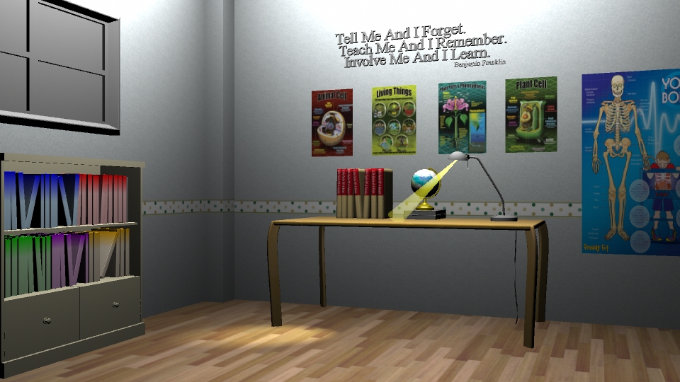
After taking into the consideration to make my digital set more engaging, I've added texture to the wall and the ground. I've also added an educational quote and posters into my scene.
I still have to unlink the spotlight to the table as the light is passing through it. As for now, this is what I have. I also still adjusting the room's light in general because there is a hotspot created by the area light in my scene. In terms of texturing it, I would refine the wall's texture by moving the border of the room slightly higher.


get some colour on those walls - it's not a hospital - a pale blue or green? Also - I think you should include a skirting board too, for detail's sake. Also - those posters are very neat, Ayunie - maybe think about giving them a less surgical, regimented look? Just think about this as a human space, not simply as a CGI set - think about all the little details that will sell it as a credible space (I like the quote - nice touch, but I'm wondering if should also be on a poster as part of that back wall?)
ReplyDeleteWill work on those Phil, Thank you! :) The Walls are pale blue but my lighting has made it looked white. Still working on those too :)
Delete